
Below is a graph of casualties in Iraq over the last three years. The success of “The Surge”, as depicted by the American administration, is shown to be a pack of lies.
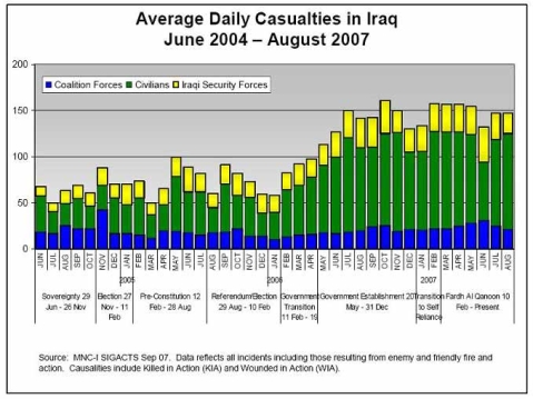
The graph is courtesy of “Mother Jones”, and can be viewed in greater detail HERE.
Filed under: Who’s kidding who?
Wow – that says it all.
Flimsy – provided the figures are accurate, and there’s no reason to believe they’re not, then it does, indeed, say it all.